


Overview
Where Green Meets Growth. GEFE 2027 is the next evolution of EuroCham Vietnam’s flagship platform — renamed from Green Economy to Growth Economic Forum & Exhibition, because true economic growth must be green. The identity had to carry that shift across three days, 30+ sessions and 200+ exhibitors: from commitment to action.
Event: Growth Economic Forum & Exhibition 2027 · 9–11 March 2027 · Thiskyhall Sala, HCMC
Scope: Brand Positioning, Logo Design, Visual Identity, Event Collateral
Deliverables: Brand Guideline, Key Visual, Stage & Expo Screens, Backdrops, Roll-up Standees
The Challenge
Not a place to announce ambitions — but where barriers are addressed and progress begins. The forum had to feel credible, actionable and forward-building: green framed as growth — competitiveness, capital, skills and infrastructure — not sacrifice.
Design Principles
Precision over organic expression. Clear geometry and disciplined grids — no generic leaves, droplets or soft illustrative motifs.
Green as part of the palette. Neutral tones and a contrasting accent keep the identity from feeling “greenwashed”.
Balance Europe and Vietnam. The five-pointed star is a shared geometric reference, legible from both perspectives.
Structured typography. A modern sans-serif with clear hierarchy, built for dense bilingual agendas, speakers and sponsors.
The Concept
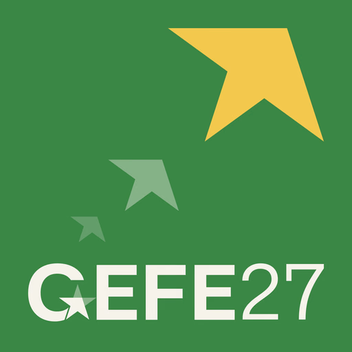
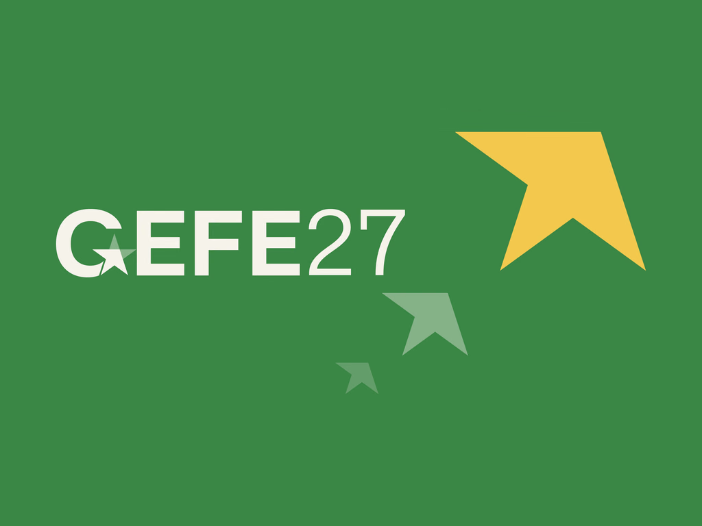
One star, shared by two flags. The five-pointed star appears on both the Vietnamese flag and the flag of the European Union. GEFE turns that shared geometry into its mark: the star sits inside the G, then breaks free as an arrow — a symbol of direction, decisiveness and forward progress.


