Overview
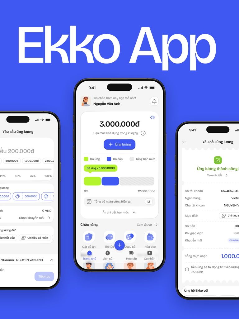
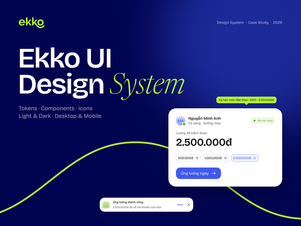
One source of truth, built to flow. A token-driven design system that keeps Ekko’s earned-wage-access product consistent across light & dark, desktop & mobile — so every screen flows the same way.
Role: UX/UI Designer
Scope: Tokens · Components · Icons
Built with: Figma Variables · Plugin API
By the numbers: 302 design variables across 5 collections · 2 × 2 theme & device modes · 69 component sets with 1,200+ variants · 4,567 icons in 6 styles
The Challenge
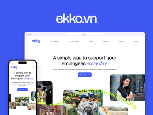
Ekko grew fast — a worker app, an employer dashboard and a marketing site. Colors were eyeballed, components were rebuilt screen by screen, and dark mode was an afterthought. Every new feature added design debt.
The Approach
A variable-first rebuild in Figma: brand primitives feed semantic tokens, components bind only to semantic tokens, and every token ships with Light / Dark and Desktop / Mobile modes — one change ripples everywhere.
Token Architecture
Three layers. One change. Components never touch a raw hex. They bind to semantic tokens, which alias primitives, which trace back to four brand colors — so a rebrand or a new theme is a one-line change.
Brand core. 4 identity anchors — Payday Blue, Lime, Jade and Midnight.
Primitives. 155 raw values in scales from 50 to 900.
Semantic. 61 tokens with Light / Dark modes.
Color & Typography
Four brand anchors expand into 10-step scales, plus status ramps for success, warning and error — so every state reads clearly in both themes. Bricolage Grotesque carries UI, headings and body; Newsreader Italic adds one or two words of emphasis, never body copy or UI labels.
Iconography
4,567 icons, six styles. One 24px grid and a 1.5px stroke across finance, people, time and status metaphors — every icon is a component with six style variants (Stroke, Twotone, Duotone, Solid, Bulk, Duotone Brand), colored by tokens so it themes itself.
Components
Built once, used everywhere: 69 component sets and 1,200+ variants, every state bound to tokens — from buttons, inputs, badges and chips to selection controls, avatars, tabs and alerts.
Theming
Two themes, zero rework. Same components, same layers — only the variable mode changes. Highlight flips from Payday Blue to Lime, surfaces from white to graphite.


